
css制作三角形
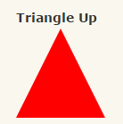
#***-up {
width: 0;
height: 0;
border-left: 50px solid transparent;
border-right: 50px solid transparent;
border-bottom: 100px solid red;
}

#***-down {
width: 0;
height: 0;
border-left: 50px solid transparent;
border-right: 50px solid transparent;
border-top: 100px solid red;
}

#***-left {
width:
0;
height: 0;
border-top: 50px solid transparent;
border-right: 100px solid red;
border-bottom: 50px solid
transparent;
}

#***-right {
width: 0;
height: 0;
border-top: 50px solid
transparent;
border-left: 100px solid red;
border-bottom:
50px solid transparent;
}

#***-topleft {
width: 0;
height: 0;
border-top: 100px solid red;
border-right: 100px solid transparent;
}

#***-topright {
width: 0;
height: 0;
border-top: 100px solid red;
border-left: 100px solid transparent;
}

#***-bottomleft {
width: 0;
height: 0;
border-bottom: 100px solid red;
border-right: 100px solid transparent;
}

#***-bottomright {
width: 0;
height: 0;
border-bottom: 100px solid red;
border-left: 100px solid transparent;
}


