鸿蒙开发:资讯项目实战之底部导航封装
前言
本文API>=13
因为我们这个资讯项目采用的是组件化的方式开发,进而,在前几篇的文章,我们对组件化运行做了详细的概述,如今已经实现了各个组件的单独运行,终于可以进行项目的下一步了,今天这篇文章,我们实现一个项目中一个比较重要的功能,那就是底部导航。
底部tab导航,也就是主页面的四个tab,我们需要在主入口Index页面中进行配置。
在项目立项之初,针对项目中遇到的技术,我有做过简单的概述,那就是除了知识点的讲解之外,最主要的是功能封装。
底部导航
底部导航可以说是应用中最常见的一种导航方式,可以说每个应用几乎都存在,随便打开一个应用,比如微信,比如支付宝等等,主页面的底部,都有一个底部导航,对于这种导航,它能够分清整个应用的功能分类,以及页签对应的内容,并且呢,还位于底部,更加能够方便用户的单手操作,这也是为什么底部导航可以一直做为主流在使用。
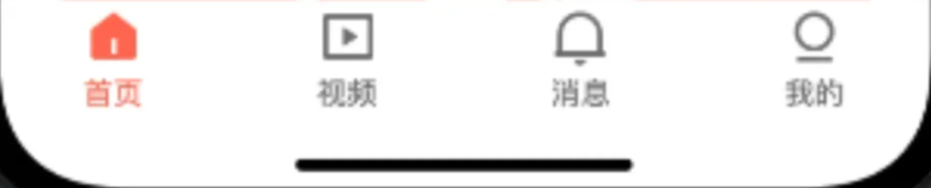
实现一个导航,鸿蒙开发中为了提供了tabs组件,使用它,可以很方便的进行实现,如下代码,举了一个很简单的例子,使用Tabs组件包裹住每个页签,使用TabContent做为页面内容,tabBar做为页签。
Tabs() {
        TabContent() {
          Text('首页内容').fontSize(30)
        }
        .tabBar('首页')

        TabContent() {
          Text('视频内容').fontSize(30)
        }
        .tabBar('视频')

        TabContent() {
          Text('消息内容').fontSize(30)
        }
        .tabBar('消息')

        TabContent() {
          Text('我的内容').fontSize(30)
        }
        .tabBar("我的")
      }
效果如下:
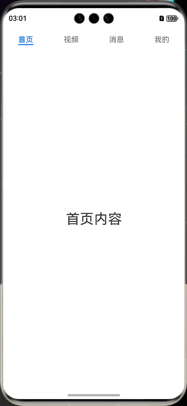
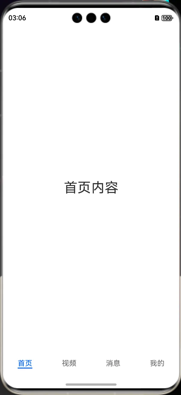
默认情况下,导航栏位于顶部,位置属性barPosition,为BarPosition.Start,如果要设置为底部导航,需要将barPosition设置为BarPosition.End。
两种方式,一种是设置barPosition属性:
Tabs() {

      }.barPosition(BarPosition.End)
一种是设置barPosition参数:
Tabs({ barPosition: BarPosition.End }) {

      }
两种方式的效果是一样的,都会把导航栏设置在底部,效果如下:
更改导航样式
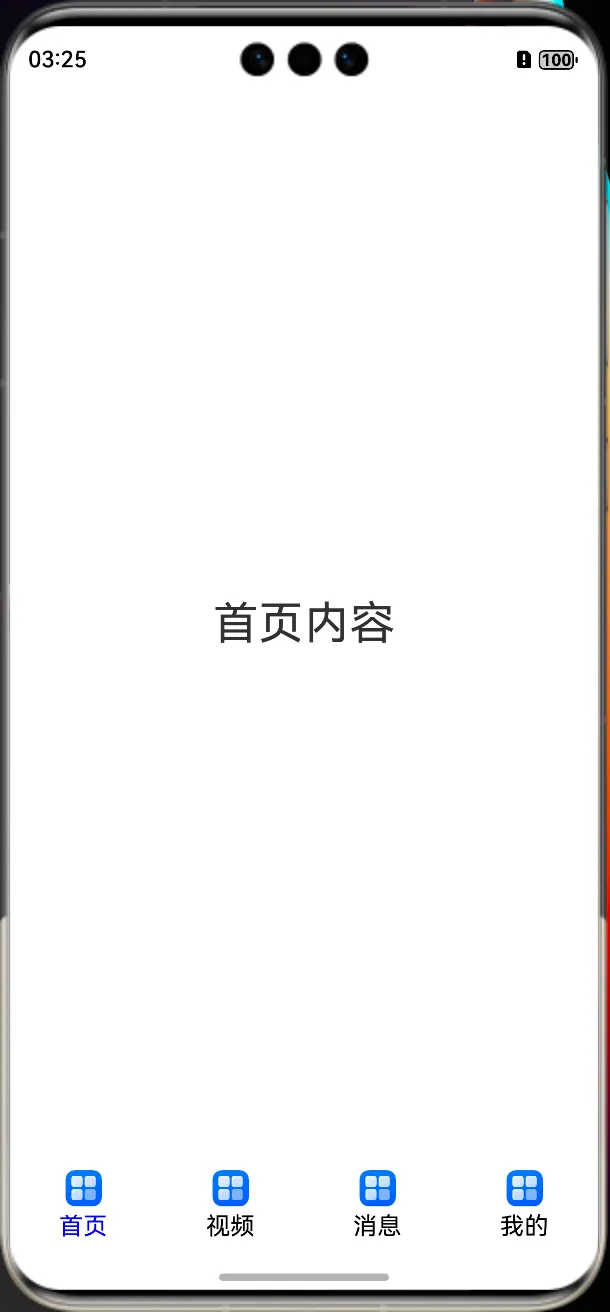
我们虽然简单实现了底部导航,但是,我们项目中是icon和文字相结合的方式,那么这种方式如何实现呢?实现起来也是非常的简单,打开tabBar的源码,我们可以看到,它不仅可以接收一个字符串,还可以接收一个自定一的@Builder。
c(options: string | Resource | CustomBuilder | TabBarOptions): TabContentAttribute;
比如,我们先随便定义一个Builder,icon和文字结合的方式。
@Builder
  tabBuilder(title: string,targetIndex: number) {
    Column(){

      Image(this.selectedIndex === targetIndex ? $r('app.media.startIcon') : $r('app.media.startIcon'))
        .width(24)
        .height(24)
        .margin({ bottom: 4 })
        .objectFit(ImageFit.Contain)

      Text(title).fontColor(this.selectedIndex === targetIndex ? '#1698CE' : '#6B6B6B')

    }.width('100%')
    .height(50)
    .justifyContent(FlexAlign.Center)
  }
定义好之后,就可以把原来的Builder内容更改为这个Builder了,为了能够状态的改变,这里,我们需要定义一个全局的索引,在页面发生切换的时候,进行赋值,使其状态发生改变,所有代码如下:
@Entry
@Component
struct Index {
  @State selectedIndex: number = 0;

  build() {
    Column() {
      Tabs({ barPosition: BarPosition.End }) {
        TabContent() {
          Text('首页内容').fontSize(30)
        }
        .tabBar(this.tabBuilder("首页", 0))

        TabContent() {
          Text('视频内容').fontSize(30)
        }
        .tabBar(this.tabBuilder("视频", 1))

        TabContent() {
          Text('消息内容').fontSize(30)
        }
        .tabBar(this.tabBuilder("消息", 2))

        TabContent() {
          Text('我的内容').fontSize(30)
        }
        .tabBar(this.tabBuilder("我的", 3))
      }.onChange((index: number) => {
        this.selectedIndex = index;
      })

    }
  }

  @Builder
  tabBuilder(title: string, targetIndex: number) {
    Column() {

      Image(this.selectedIndex === targetIndex ? $r('app.media.startIcon') : $r('app.media.startIcon'))
        .width(24)
        .height(24)
        .margin({ bottom: 4 })
        .objectFit(ImageFit.Contain)

      Text(title).fontColor(this.selectedIndex === targetIndex ? Color.Blue : Color.Black)

    }.width('100%')
    .height(50)
    .justifyContent(FlexAlign.Center)
  }
}
我们看下效果,当然了,这只是一个demo,样式和图片先不用关心。
导航封装
封装的目的在于复用,日后其他的项目,我们可以直接拿来使用;既然要封装,首先我们要确定一下封装的逻辑,首先呢,我们要清楚,那就是每个项目的导航数量是不一样的,所以数量不要固定,需要外部传递,除了数量,还有icon图标,文字,以及图片的宽高,文字的样式,等等都需要进行外部传递,当然了,页面的UI也需要外部自行定义,这样也能使其封装的灵活。
底部导航BottomTabView全部代码如下:
import { BottomTabBean } from "../model/BottomTabBean"

/**
 *AUTHOR:AbnerMing
 *DATE:2025/6/26
 *INTRODUCE:底部的tab导航
 */


@ComponentV2
export struct BottomTabView {
  @Param @Once selectedIndex: number = 0 //当前切换的索引
  @BuilderParam itemLayout: (index: number) => void //页面UI
  @Param tabList: BottomTabBean[] = []
  tabSelectedColor: ResourceColor = Color.Red //文字选中的颜色
  tabNormalColor: ResourceColor = Color.Black //文字未选中的颜色
  tabSize?: number | string | Resource = 14 //文字的大小
  tabHeight?: Length //tab的高度
  iconWidth?: Length = 24 //icon的宽度
  iconHeight?: Length = 24 //icon的高度
  tabTitleMarginTop: Length = 10 //标题距离icon的距离
  onChange?: Callback<number>
  scrollable?: boolean = false //是否可滑动
  controller?: TabsController

  build() {
    Tabs({ barPosition: BarPosition.End,controller:this.controller }) {
      ForEach(this.tabList, (item: BottomTabBean, index: number) => {
        TabContent() {
          if (this.itemLayout != undefined) {
            this.itemLayout(index)
          }
        }.tabBar(this.tabBuilder(item, index))
      })
    }.scrollable(this.scrollable)
    .barHeight(this.tabHeight)
    .tabIndex(this.selectedIndex)
    .onChange((index: number) => {
      this.selectedIndex = index
      if (this.onChange != undefined) {
        this.onChange(index)
      }
    })
  }

  @Builder
  tabBuilder(item: BottomTabBean, targetIndex: number) {
    Column() {

      Image(this.selectedIndex === targetIndex ? item.selectedIcon : item.normalIcon)
        .width(this.iconWidth)
        .height(this.iconHeight)
        .objectFit(ImageFit.Contain)

      Text(item.title)
        .fontSize(this.tabSize)
        .margin({ top: this.tabTitleMarginTop })
        .fontColor(this.selectedIndex === targetIndex ? this.tabSelectedColor : this.tabNormalColor)

    }.width("100%")
    .height("100%")
    .justifyContent(FlexAlign.Center)
  }
}
用到的数据对象如下:
/**
 *AUTHOR:AbnerMing
 *DATE:2025/6/26
 *INTRODUCE:底部导航数据
 */

export class BottomTabBean {
  title?: string //tab标题
  selectedIcon?: PixelMap | ResourceStr | DrawableDescriptor //选中icon
  normalIcon?: PixelMap | ResourceStr | DrawableDescriptor //未选中icon

  constructor(title?: string, selectedIcon?: PixelMap | ResourceStr | DrawableDescriptor,
    normalIcon?: PixelMap | ResourceStr | DrawableDescriptor) {
    this.title = title
    this.selectedIcon = selectedIcon
    this.normalIcon = normalIcon
  }
}
简单使用:
@Entry
@Component
struct Index {
  @Builder
  itemLayout(index: number) {
    Column() {
      Text("当前页面:" + index)
    }.width("100%")
    .height("100%")
    .justifyContent(FlexAlign.Center)
  }

  build() {
    Column() {
      BottomTabView({
        itemLayout: this.itemLayout,
        tabList: [
          new BottomTabBean("首页", $r("app.media.startIcon"), $r("app.media.startIcon")),
          new BottomTabBean("视频", $r("app.media.startIcon"), $r("app.media.startIcon")),
          new BottomTabBean("消息", $r("app.media.startIcon"), $r("app.media.startIcon")),
          new BottomTabBean("我的", $r("app.media.startIcon"), $r("app.media.startIcon"))
        ]
      })
    }
  }
}
相关总结
底部导航,目前封装了基本功能使用,如果你要实现其他的特殊功能,比如中间图片放大,或者长按,双击等动作,可以再次拓展。
本文标签:鸿蒙新闻资讯类应用
#鸿蒙开发#简单的也好,复杂的也罢,关于HarmonyOS,总要深入浅出,总要步步为赢。

 查看1道真题和解析